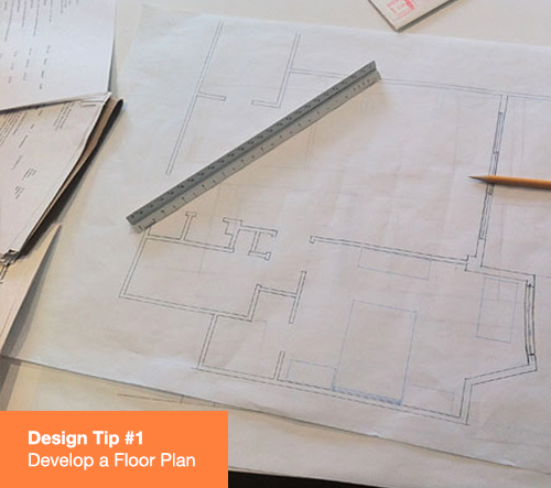


A well-thought out floor plan will be your roadmap to success. Don’t be intimidated- you don’t necessarily need to call in a team of architects. A floor plan is simply a measured drawing of the space which will allow you to play with furniture size and placement. It is so worth spending some time with a measuring tape and graph paper before you invest in fine pieces of furniture that may ultimately not be suited for the space.

One of the biggest challenges that I have with clients is to get them to focus on what I refer to as “the envelope”. Ultimately furnishings are only part of the puzzle. Consideration needs to be given to things such as floor type and color, the texture of the walls and ceilings, and architectural details such as moldings, cornices and casings. Sometimes just gutsier baseboards, door casings and window trims are exactly what is needed to give a room the desired gravitas.

Scale is a key element of design. We have all gone into a room at one time or another and felt uncomfortable because the furnishings seemed either too large, too small or all the same size. Perhaps an easy way to explain how I deal with this is to focus on ceiling heights. If the ceilings are high, I like larger scale upholstery to help bridge the gap between the floor and ceiling. Conversely if the ceilings are low, regardless of the room size, I prefer longer, lower upholstered pieces, accentuated with taller, thinner objects such as floor lamps, bookcases and open arm chairs. This is one area where you need to “listen” to what the room is telling you.

When developing a furniture plan, consider the use and benefits of the room. Make spaces within the room that have equal appeal. If you are working on a living room, for example, avoid the standard sofa and two chairs as your only arrangement. Consider a love seat at another end of the room or another pair of chairs or even some stools for extra seating. If it is a bedroom you are creating, consider a chair and ottoman for reading the morning paper or a dressing table with an upholstered sitting piece.

Try to find some one thing that inspires you. It could be a anything ranging from a piece of art to a piece of fabric to the view just outside the windows. Choose three to five colors and don’t be intimidated! Some of the colors may only show up in a pillow or a trim as accents.

Paint is one of the least expensive tools at your disposal. If you paint a room and you don’t like it, simple repaint! I recommend doing sample boards before you splash your entire house with color. Most paint stores will sell you small amounts just for this purpose. Once your samples are prepared, leave them out and look at them. How do they look at different times of the day? If you have a palette for a suite of rooms or an entire house, do the colors work together? One important tip: Take the time and properly sand, caulk and prime the walls and the trim. The payoff for this extra bit of work of is huge!

The colors and designs of rooms that are adjacent or open in to each other should relate to one another. Pull the background color out of a fabric print in one room that may be on a chair or pillow and use it as the wall color in the adjoining space. I tend to keep the trim color the same from room to room which only serves to reinforce the “conversation”.

Spend the few extra dollars and have your upholstery filled with down or at least down-wrapped cushions. The luxury experience is well worth the extra cost. Also, don't forget about pillows. They may look nice in place but they need to provide comfort. Again, use down stuffers. Tip: Per square inch, a good pillow can be wildly expensive. I typically wait until the end of a project to create uniquely patterned pillows fashioned from scraps left over from the draperies, sofas and chairs.

I often use custom iron rods and rings mounted as high as possible with simple drapery panels decorated with a contrast band. To minimize sun damage, I like to double line the panels which also helps provide a room darkening effect. To further effect design possibilities I install shades behind the draperies. I NEVER use standard hardware shades but instead use matchstick or bamboo blinds or a custom roman shade. Tip: Off the shelf adjustable drapery hardware can make it very difficult to slide your draperies. A custom-cut drapery rod is a good investment and will save you years of aggravation.

Create pools of lights with lamps and avoid excessive use of overhead cans. I also consider lampshades to be a worthy decorative element. Bring your lamp to a specialty shop and seek some advice with respect to size, proportion and material of the shade. I also like to apply decorative trims that relate to the room decor. Tip: Always install high/low switches on the lamp cords so you can vary the light around a room to create that special ambiance.

We all want to make our guests as comfortable as possible. If the coffee table is your only table in a living room grouping, it is a long reach for your guests to place their drinks. Small side tables, whether a small cocktail table or a broken up set of nesting tables, will allow your guests to settle in and enjoy whatever is happening in your space.

Accessories are your opportunity to make your space unique. You don’t necessarily need to leave the house to find these items. Shells collected on treasured family vacations look great scattered on tables and atop stacks of books; a bag of childhood marbles can be displayed in that great cut glass bowl that you usually take out only at holidays; frame some of those old family photos and display them on consoles, end tables, bookcases…any place where one can see and enjoy.
